The "travel screen" from The Oregon Trail is an iconic image, instantly recognizable to millions of people – a small, blocky representation of an ox pulling a covered wagon across an abstract landscape. The scene is so familiar that it has permeated our culture, featured in countless internet memes. The imagery even appears on T-shirts:

So where did this screen come from? How was it designed? Why does it look the way it does? I can provide the answers to these questions, because I was the lead designer of the 1985 version of The Oregon Trail. It was in this version that the travel screen first appeared, along with nearly all of the other features now associated with the game. However, the key concept for this famous screen did not originate with me, but with a colleague who happened to make an insightful comment at just the right moment. And so the story of the travel screen is not only a tale of hard work, team cooperation, and incremental design – but also a tale of serendipity.
Before the famous Apple II version of The Oregon Trail appeared in 1985, it was preceded by two other versions – first the original, text-only timeshare version, and then an early Apple II version that was largely identical to the timeshare game (but with a few important differences). The original version, first invented in 1971, became available for use when it appeared on the MECC timeshare system in 1975. MECC – the Minnesota Educational Computing Consortium – was at that time a state agency dedicated to providing computer access to schools across the state of Minnesota. The game, simply called OREGON at the time, soon became the most popular computer program on the system.
The following is an excerpt from a session of the game, played on a teletype machine. Most of the text was printed by the computer, but the parts highlighted in yellow are the responses typed by the user:
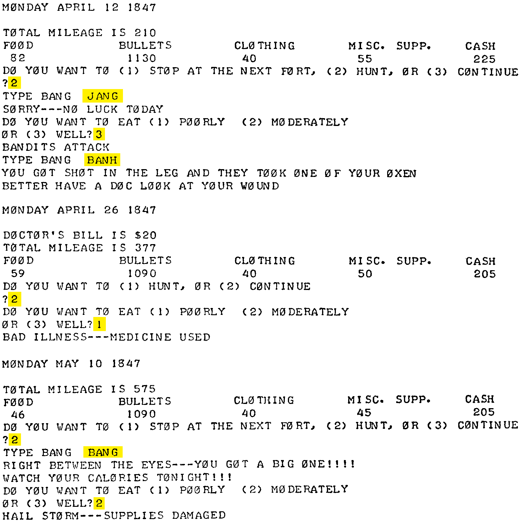
As you can see from this excerpt, the original version of the game presented a series of decision points and incidents, occurring at two-week intervals. To provide the user with an indication of progress, the mileage from the starting point is listed each time the date changes.
The first Apple II version, which MECC published in 1980, remained quite faithful to original timeshare version. In fact, all but two screens in the 1980 product were presented entirely in text. However, the two new screens each introduced an important new idea. One new screen presented the first graphical version of the hunting activity (detailed in a separate story). The other new screen displayed a map to indicate the player’s current location on the trail:
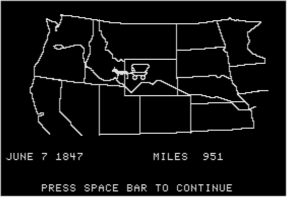
This map automatically appeared every time the date changed, and the little wagon would blink a few times, shifting position slightly as it blinked. The blinking and shifting of position provided a sense of making progress on the trail – more effectively than just listing the current mileage.
Unlike this first Apple II version, which preserved nearly all of the text, logic, and programming from the original timeshare game, my design for the 1985 product was a complete reimagining of the game, starting from scratch. I retained a few of the key concepts from the timeshare game, but I discarded all of the original text, logic, and programming. I added a great number of new concepts, constructing a much more elaborate design than the timeshare game. However, these new ideas did not all come entirely from me. My colleagues on the team also contributed new ideas at each step of the creation process, and I was able to work a lot of these ideas into the design. With regards to the travel screen, I worked most closely with Charolyn Kapplinger, the lead graphic designer for the project, and John Krenz, the lead programmer.
The foundation of my design for The Oregon Trail was a set of nested cycles – a daily cycle inside of a landmark-to-landmark travel cycle. Both of these cycles represented a dramatic departure from the structure of the original game. The timeshare game was based on a simple two-week cycle, without any reference to specific geographic features along the trail. Every two weeks the date, mileage, and level of supplies would get updated. In contrast, my new design was intimately connected to the actual geography of the trail. This is most obvious in the frequent appearance of familiar landmarks – but also in terms of the climate and weather, and the plants and animals that appear in the hunting activity.
Instead of updating the date, mileage, and supplies every two weeks – or at every landmark – my design called for all data to be updated on a daily basis – with the daily update visible on the screen. Furthermore, critical events can occur on any day of the journey, not just at landmarks. But this led to a problem, because a typical journey to Oregon would last five months (150 days) or more. It would be frustrating if the game paused 150 times to ask the player what he wanted to do next. My solution was that the game should run automatically between landmarks, only stopping if an important event occurred, or if the player pressed a key to pause the game. But this solution meant that a special screen needed to appear during the travel between landmarks – showing the daily updating of the data, and allowing the player to pause if desired.
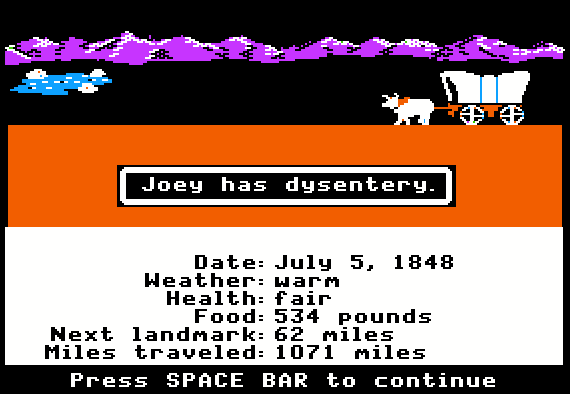
So this was the reason that I designed the “travel screen”, which would appear whenever the player traveled between landmarks, showing the passage of time and the progress towards the next landmark. My original concept was to include a large graphic to illustrate the current terrain – prairie in the east, mountains farther west, and so on. There would also be a set of constantly updated status information – the current date, current weather, miles traveled, food remaining, and the travel party’s general health. The travel screen that we built for the Alpha product – that is, the first half-built testable version of the game – looked like this:
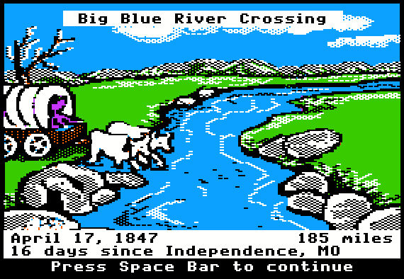
Approximately every two seconds, the date in lower left corner advances to the next day – and all the other data on the screen updates accordingly. Therefore the idea behind this screen is that the player would carefully watch the data (especially the health and food data) until the next landmark was reached, and would interrupt the travel if any of the data began to look seriously bad. When the player finally reaches the next landmark, a full-screen graphic appears, depicting the landmark and celebrating the user’s arrival. This is the alpha version of the first landmark graphic on the route:
When I created the design for this interaction sequence, I was pretty happy with it. However, after John programmed it according to my specs, incorporating the beautiful graphics that Charolyn created, it was clear that the design did not work as well as I had hoped. Watching the data on the travel screen was, in fact, rather boring. I now realized that the travel screen did not provide any real sense of traveling across the prairie – despite the large, colorful graphic. When we tested this design with kids, we verified what we already suspected – that the travel screen needed to be redesigned to make it more interesting.
In addition to the main problem – that the travel screen was not sufficiently engaging – I also felt that my original design had a second, subtle problem. In my opinion, the impact of arriving at each landmark was too muted. The large graphic on the travel screen was just too similar in size and appearance to the graphic on the landmark screen. We needed a travel screen that was not only more engaging, but we also needed it to provide a sharp contrast to the landmark screen, so that the arrival at the next landmark would seem like an important event.
Some of the people who played the Alpha version of the game felt that the answer was to replace the travel screen with a map screen, as in the earlier Apple II product. I certainly intended to include a map in the product, but I felt that replacing the travel screen with a map was not a good solution. For most users, staring at the map while the daily data updated would be just as boring as the Alpha version of the travel screen – and perhaps even worse.
I wrote up and circulated a document that analyzed these issues, and soon thereafter we held an impromptu team meeting in John’s cubicle to discuss the matter. We were huddled around John’s computer, looking at the screen and brainstorming ideas, when another programmer who was not on the team walked up. This programmer, Bill Way, had developed a well-deserved reputation at MECC for his ability to design and program tiny, cute animations. We explained the situation to him, and he promptly suggested that we incorporate a tiny animation of an ox pulling a wagon across the prairie. We all thought that the idea sounded promising – and we promptly agreed to give it a try.
Within a day or two we prepared an initial demo of the concept. This animation was nothing more than a tiny ox pulling a little wagon across a black screen – but it was delightful. The team immediately agreed that we should continue exploring this approach.

Over the next few weeks we made many enhancements to this new travel screen, in a step-by-step incremental process:
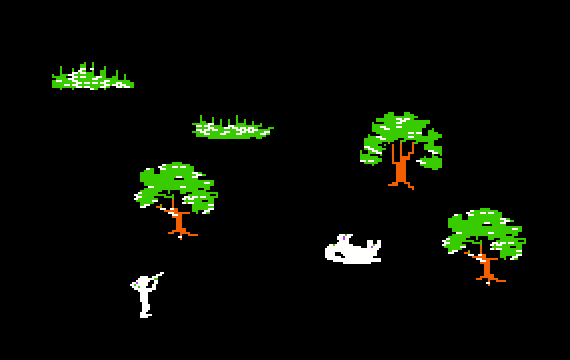
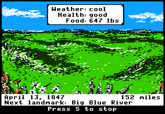
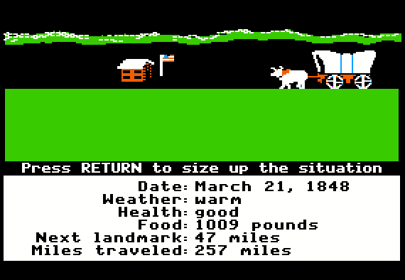
After all of this evolution was complete, the travel screen looked like this:
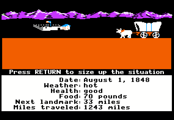
Here is another example, in the mountains with drought conditions:
And finally, here is an example that illustrates a random event:
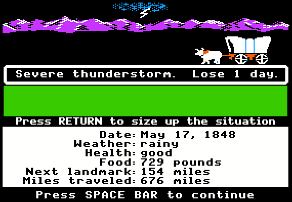
Despite the many benefits of this new travel screen, I worried about certain minor issues. Even though the animation added a huge amount of appeal to the product, as well as communicating many key bits of information, I worried that it only showed a single ox, instead of several pairs of oxen. I found this to be seriously misleading. And the animation reinforced the misconception – already an issue with my design – that the player’s wagon was traveling alone on the trail. However, weighing the pros and cons, it was clear that this new screen was a huge winner, and that any disadvantages were trivial compared to the advantages.
The entire team agreed that we should replace the Alpha version of the travel screen with the new design – and this is what we included in the finished product that MECC published in July 1985. Needless to say, the new travel screen was extraordinarily successful. Instead of being bored with this screen, kids paid very close attention to it – a major improvement from the Alpha version. Of course, most kids watch the animation more closely than the data, but at least they remain fully engaged. Ultimately, this screen became the de facto branding for the entire product. In other words, when people think of The Oregon Trail, the first image that comes to mind is usually the travel screen. Furthermore, this is the screen that most often appears when people publish a screen capture from the product.
In fact, in almost any story on the internet that purports to show a screen from the “original” Oregon Trail game, what actually appears is the travel screen from the 1985 Apple II version. But in a way this makes sense, because most of the features and details that people associate with the game actually originated in the 1985 product.