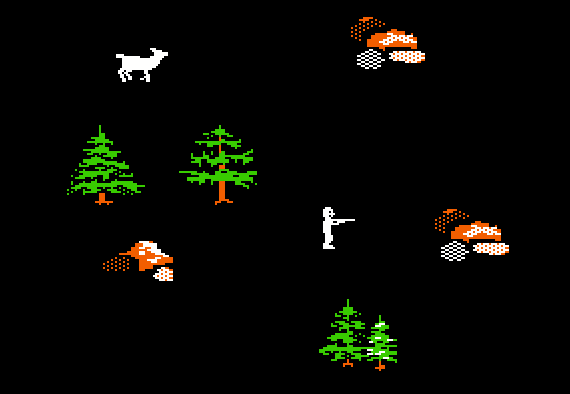
What??? I can only carry 100 pounds of meat back to the wagon!?! And why do those dead buffalo stick their legs straight up in the air?
Have you ever wondered how the designers of the classic versions of The Oregon Trail came up with decisions such as these? If so, then you have come to the right place, because I was there when those features were designed – and I am about to spill the secrets.
In 1984 I was given the assignment to help create a completely new version of The Oregon Trail. The text-based version of the game had already been around for more than a decade – but in all that time the game had never been substantially modified, much less redesigned from the ground up. But that was about to change. MECC, the publisher of the game, was ready to replace the aging product with something completely new, and I was selected to be the team leader and lead designer for the project.
The original timeshare version of OREGON, first invented in 1971, was played on a teletype machine. The game involved a lot of shooting. In the following typical interaction, the parts typed by the player are highlighted in yellow:
Each time that a shooting opportunity arose, the player was instructed to type “BANG”. If the player typed quickly and accurately, then his shooting would be successful. In a hunting situation (as opposed to shooting at bandits, “hostile riders”, or wolves) this meant that the food supply would increase.
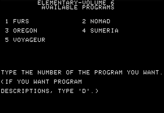
In 1980, MECC released a version of OREGON for the Apple II, as part of a product called Elementary Volume 6. On the main menu page of the product, OREGON is the third of five different activities:
In most respects, this first Apple II version was identical to the original timeshare version. However, there was one very important difference: All of the shooting activities were now graphics-based instead of text-based. You could actually see what you were shooting at. Instead of typing “BANG” to shoot, you simply pressed any key on the keyboard to fire your gun:

Each time that the player chose to go hunting, a picture of a deer would creep very, very slowly across the screen. Each time that the deer reached the right edge of the screen, it would reappear at the left edge. Each time that the player pressed any key, a cluster of 8 bullets would creep very, very slowly up the middle of the screen. Oddly, the right time to fire the gun was when the deer was about to disappear off the right edge. If the player was lucky, then the deer and the bullets would meet in the middle, as shown above.
Except for the shooting activities, the 1980 game was still text-based, essentially unchanged from the original timeshare version. Despite the peculiar slow-motion nature of the activity, hunting was by far the best known part of the game, and the main reason that many kids (especially boys) enjoyed playing the game.
Therefore, even before we began work on the brand new version of The Oregon Trail in 1984, it was assumed that the product would include some sort of hunting activity. I knew that this part of the game would get a lot of use as well as critical scrutiny. Because MECC would sell the new game in both the home and school markets, it was clear that hunting would need to be a highly engaging activity, with a lot of gameplay value. But I also wanted to include some subtle educational lessons, particularly with regards to the geography of the West.
I soon decided that my goal was to design a hunting game that provided a sense of actually going out into the landscape and hunting for animals. I wanted the player to be able to see the landscape – whether it was prairie, mountains, desert, or whatever. This was quite a challenge on the Apple II, which had only six colors and a fairly low resolution. I also wanted the hunting to be somewhat difficult for the first-time hunter. The hunter would need to go hunting several times before he or she mastered the skills needed to be successful.
Right from the beginning of the project, I frequently brainstormed with my teammates to discuss possible approaches for the hunting activity. At first, I invited all of my teammates – and anyone else who was interested – to participate in the brainstorming. After enough ideas had been generated, I pared down the participants to a “kernel” of three people – myself, Bob Granvin, and John Krenz. The three of us rapidly sorted through the ideas and picked a clear direction to pursue, along with some of the key features.
After careful consideration, we decided that a third-person viewpoint would be more practical than a first-person viewpoint. In other words, there would be a little character on the screen – controlled by the player – that carried a gun and did the shooting. The player directs the hunter to point the rifle in any of 8 directions – up, down, left, right, and the 4 diagonals – and to fire the rifle in any of these directions. Furthermore, the player can direct the character to walk in any of the 8 directions, or to stop walking. Keep in mind that the Apple II had no mouse, and only a limited number of people had purchased a joystick. Therefore all of these actions would have to be controlled by the keyboard. On a monochrome monitor, the 8 positions of the hunter looked like this:

We were initially puzzled as to how to present the landscape, given that I wanted the landscape to be different with every play of the game, but I also wanted the landscape to reflect the geography of the player’s current location on the trail. I brainstormed various possibilities with the team, including Charolyn Kaplinger, the graphic artist. Eventually we settled on an abstract minimalist scheme, in which the hunting game occupies the entire screen. Much of the screen is black, but scattered around the screen are objects – rocks, trees, clumps of grass, etc. – that indicate the current landscape. Furthermore, each of these objects presents an obstacle to the player. You have to walk around a tree or a large rock – you cannot walk through it.
By this time we already had doubts that the hunting game could be created using Applesoft BASIC – the programming language that we were using for the rest of the product. Most other companies out there – especially companies that specialized in pure entertainment games – created their action games in assembly language. However, before giving us permission to program the hunting activity in assembly language, my supervisor first wanted to see the results if we attempted to program it in BASIC. So Bob Granvin created a BASIC prototype, minus the animals. The prototype was helpful in demonstrating the concepts that we had in mind, but even without the animals the prototype was too sluggish to be practical.
So we finally got permission to add an assembly language programmer to the team – Roger Shimada. From that point on, I met frequently with Roger – joined by Bob in our earliest meetings – to discuss the plans for the hunting game. Although the team had created a short concept document, we had never written up the formal specs for the hunting game – the details were in our heads. So Bob showed Roger the prototype, and then I explained to Roger the additional details we had planned. However, it soon became apparent that there were many more details that I needed to provide to Roger, such as:
While I set about answering these questions, I left it to Roger and Charolyn to collaborate on the details of the animation – such as how many phases (distinct images) to use in the animation of the animals. And I left it to Roger and John to collaborate as to what parts of the Apple II memory that Roger could use, based on John’s technology plan.
After researching what animals were found along the Oregon Trail, I put together a list of 18 species to consider for inclusion in the game. For each of them, I listed their range within the route of the Oregon Trail. I also listed the typical weight for each species – which determines how much meat is available when you shoot the animal. For practical reasons, I soon narrowed the list to 11 types of animals:
However, as Roger began to build the hunting activity, we soon ran into a problem. Each type of animal required 10 graphic states (4 animation phases plus the dead state, with each of the 5 facing both left and right). Therefore, for 11 types of animals, we needed to load 110 animal graphics into the computer’s memory – which was not possible, due to the limited space available in an Apple II. We attempted several different solutions to the problem, but none worked. Finally I reduced the animals from 11 types to just 6, and we reduced the animation from 4-phase to 3-phase. Now we only needed to load 48 images into memory, instead of 110. It was still an extremely tight fit, but we managed to cram it all in. Surprisingly, the new 3-phase animation actually looked better than the 4-phase animation, but we felt sad to limit the game to just 6 types of animals.
The next challenge was to design an algorithm that would always generate an appropriate landscape, based on your current location on the trail, and yet be different every time you went hunting. I decided that six types of objects might appear on the hunting screen – deciduous trees, coniferous trees, tufts of grass, desert shrubs, cacti, and rocks. For each of these six types of objects, I asked Charolyn to create three distinct images, for a total of 18 landscape objects. I then divided the entire Oregon Trail into five terrain zones – Eastern forest, plains, Rocky Mountains, desert, and Western forest. For each of these five zones, I specified which kinds of objects might appear – up to 3 types of objects in a particular zone:
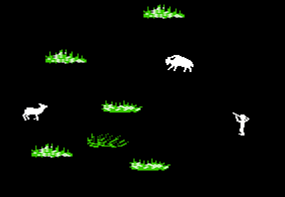
Each time you go hunting, the algorithm randomly selects four to six terrain objects from the pool of eligible objects (based on your current location on the trail), and then places the objects in random positions on the screen. Likewise, the algorithm selects appropriate animals based on your current terrain. For example, the following screen illustrates hunting in grassy plains:
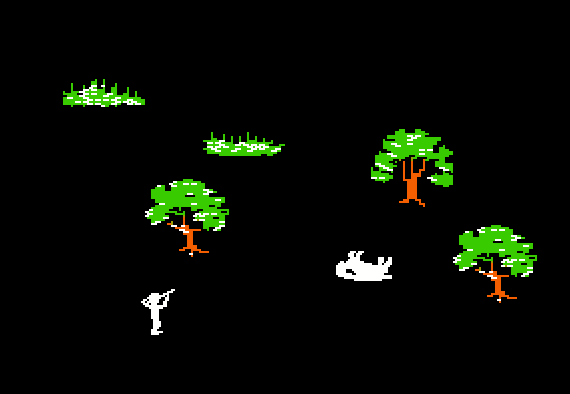
When Charolyn first delivered the animal graphics to Roger, she did not include the “dead state” graphics, which were not yet finished. Therefore in Roger’s first draft of the game, he simply flipped the animal graphic upside-down to indicate that it had been shot. When we played this first draft of the hunting game, it was hilarious to see the animals flip over. Then Charolyn delivered the dead-state graphics, and Roger put them in. The collapsed buffalo was pretty effective, but all of the other dead animals looked like lumps. Of course the solution was immediately obvious – we went back to flipping over the graphic whenever an animal was shot. This was not very realistic, but the kids loved it – and there was never any doubt as to when an animal had been killed:
One of the most controversial design decisions I made is familiar to everyone who has played The Oregon Trail. You go out hunting, and you shoot a bison. Maybe you shoot two or three bison. As the hunting session comes to an end, the screen tells you how many pounds of animals you have just killed. Then you see “However, you were only able carry 100 pounds back to the wagon.” Some people see this as a brilliant touch, while others see it as absolutely stupid. It has certainly frustrated more than one player of the game.
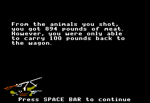
Personally, I think that it was exactly the right decision. When a traveler on the Oregon Trail went hunting, he would leave the wagon and wander off the trail, perhaps several miles, in search of game. After a successful hunt, it was necessary to haul the meat back to the wagon. But there would be a practical limit to how much meat the hunter could actually carry back. I also wanted the kids to think about the concept of wastefulness, without explicitly mentioning it. So I imposed the limit of 100 pounds – which seemed to work well both from a logical standpoint and a gameplay standpoint. (NOTE: Certain later versions of the game increased this limit to 200 pounds.)
When we tested the product with kids, this feature inspired a lot of discussion. I could see the kids thinking about the consequences of their actions. Some of the kids became exceedingly conscious of the waste, and many of them decided that they would never shoot more than one bison when they went hunting.
Another controversy I faced was the difficulty of the hunting game. Many adults who played the game told me that hunting was too hard, and that I should make it easier. Even my supervisor told me this. But to me, it was exactly the right difficulty. In real life, people who pick up a hunting rifle for the first time are not instant experts. It takes some time to learn how to use the rifle effectively, and it takes some time to learn how to find and stalk the animals. All of this is especially true if the person is using a gun similar to those in use in 1848.
When we did the user testing with kids, I saw that they struggled with hunting at first, but many of them developed a keen proficiency quite quickly – sometimes after only 3 or 4 hunting trips. In fact, the hunting interface I designed was no more difficult than the typical arcade-style games then available on the Apple II. The hunting game was specifically intended to be in the genre of an arcade game, and to be comparable to other arcade-style games. I didn’t want to dumb it down just because some adults were having problems with it.
Despite the pressure, I kept resisting the requests to make the hunting game easier. And I’m glad I did. Literally millions of kids eventually played this hunting game – and most of them enjoyed it very much. If the game had been less challenging, then it would not have been as much fun.
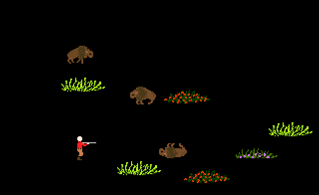
At the end of July in 1985, we finally finished and released our brand new product – the Apple II version of The Oregon Trail. Almost immediately it became a massive hit in both the school and home markets. For five years, this version of The Oregon Trail could only be played on Apple computers. Finally, in 1990, MECC released an identical version of the game for DOS (IBM computers). However, the graphics on the IBM version look slightly different than on the Apple II. For example, here is the hunting game on the IBM:
The 1985 design was later adapted to support computers with a mouse device: first a monochrome Macintosh version (1991), then a new DOS version (1992), and finally a Windows version (1993). The upshot is that an entire generation of kids grew up playing the 1985 design – either on the Apple II, an IBM compatible, or a Mac. It was the 1985 design that originated nearly all of the details and memes that people associate with The Oregon Trail. As a result, illustrations on the internet of the “original” Oregon Trail game almost always show the 1985 design, rather than the original text-only version.